Dentistry runs on minutes. I gave them back.

I was the founding product designer at Codentist — an AI-powered practice management platform that pairs intelligent diagnostics with workflow automation across scheduling, exams, treatment planning, claims, and patient engagement.

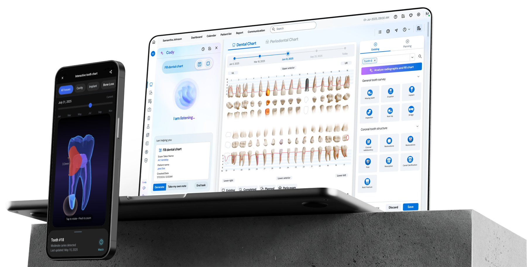
Codentist clinic workspace — dental chart with the AI copilot listening on desktop, and a 3D tooth viewer on mobile
Seed round$1.2M
Background

What is Codentist

Codentist is a startup founded by experienced dentists and ML engineers, built upon seven years of clinical research to develop AI-driven computer vision models tailored for image diagnosis. The team is now expanding its scope to address broader pain points across the whole end-to-end dental workflows.

As the only designer, I owned the product design process end to end — feature planning, user research, and design execution — working closely with engineers and clinical experts for accuracy, and supporting marketing and fundraising along the way.

My roleFounding designer
TimelineMay 2025 – Jan 2026
PlatformsClinic desktop system and patient mobile app
Team
Product designerSoftware engineerML engineerDentistOffice adminBD lead
The problem

Dental offices still run on manual, fragmented workflows

Staff shortage

Manual workflows force teams to do more with fewer hands — and every extra step lands on someone already stretched.

1in 3
practices report understaffing

High operating cost

Inefficient processes inflate labor and administrative expenses, eating into margins that are thin to begin with.

0
U.S. dental offices running on manual processes

Low patient satisfaction

Long waits and slow treatment processes are the most common complaints across the entire patient journey.

25–0
of patients report dissatisfaction
Outcomes

Where the product stands today

Fundraising
$0.0M

raised in the seed round

Efficiency
0%

fewer clicks across core flows

Sentiment
0%

positive feedback from users and investors

Speed
0%

projected reduction in average task time

Research

Mapping end-to-end, multi-user workflows

Ten-plus interviews with dentists, front-desk staff, and practice managers — looking past usability to revenue impact, efficiency gains, and patient retention.

The goal was not to transfer pain points into a “happy flow,” but to find where AI could genuinely accelerate clinic operations and create business value for future clients — workflows that practices would be motivated to adopt, not just able to use.

First schedule
PatientFront deskDentistAssistantSee ads or be referredContact office via phone / message / emailCreate accountSchedule first visiting timeSchedule appointmentSend reminders

First schedule

Back and forth discussion costs time and leads to low confirmation rates, directly hurting chair-time utilization and revenue.
Dental exam
PatientFront deskDentistAssistantFill-in medical history formsTake imaging exam and periodontal examAnalysis and fill dental chartTaking notes

Dental exam

Clinical notes and image interpretation rely on manual entry, creating heavy workload and errors.

Treatment planning
PatientFront deskDentistAssistantMake treatment planDiscuss with patientAgree one treatment plan and confirm priceSchedule treatment appointmentConfirm time

Treatment planning

Patients struggle to understand costs and outcomes, lowering acceptance rates and causing revenue loss.

Treatment
PatientFront deskDentistAssistantSigning consentTake treatmentProceed treatmentTaking notesWrite reportReceive report

Treatment

Patients lack an effective, engaging way to understand treatments, weakening long-term connection and loyalty with the clinic.

Payment & insurance
PatientFront deskDentistAssistantGenerate invoiceChoose payment methodRecord insurance infoWrite claimsWaiting for insurance verificationMoney back

Payment & insurance

Insurance verification and claims are tedious and error-prone, extending payment cycles and resulting in cash-flow pressure.

Hover or tap a step to open it. Each card shows who does what in that moment, and the pain point it creates.

Key research insight

The real bottleneck wasn’t a single task. It was the handoff between them.

Patient information, clinical findings, and administrative records were repeatedly transferred between people and systems. Each handoff introduced more manual work, lost context, and opportunities for error.

Design opportunityMake context reusable and carried by AI across the entire visit.

Define

Where AI earns its place in the workflow

With our machine-learning engineers, I analyzed what the models could genuinely do — and where their boundaries were — then mapped those strengths onto the workflow.

  • Capture

    Voice charting, note draftingSpeech-to-text, NLP

    Human controlReview and edit

  • Interpret

    Radiograph findingsComputer vision

    Human controlInspect evidence, confirm

  • Recommend

    Treatment optionsLLM reasoning, reinforcement learning

    Human controlClinician selects

  • Execute

    Scheduling, claimsWorkflow APIs, RAG

    Human controlVerify before committing

Design

The end to end designed experience

From the exam to the follow-up, each capability addresses a specific hand-off. Eight features in three stories, each built around one design decision.

Watch the demo
01

Designing AI around clinical attention.

How might AI take on the documentation and decision burden without interrupting clinical judgment?

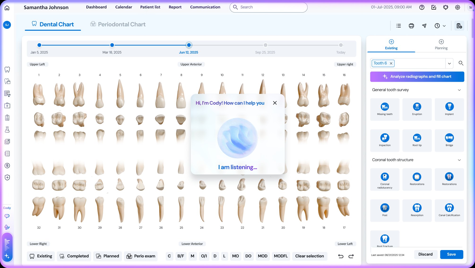
Voice-driven charting

Let the chart follow the conversation.

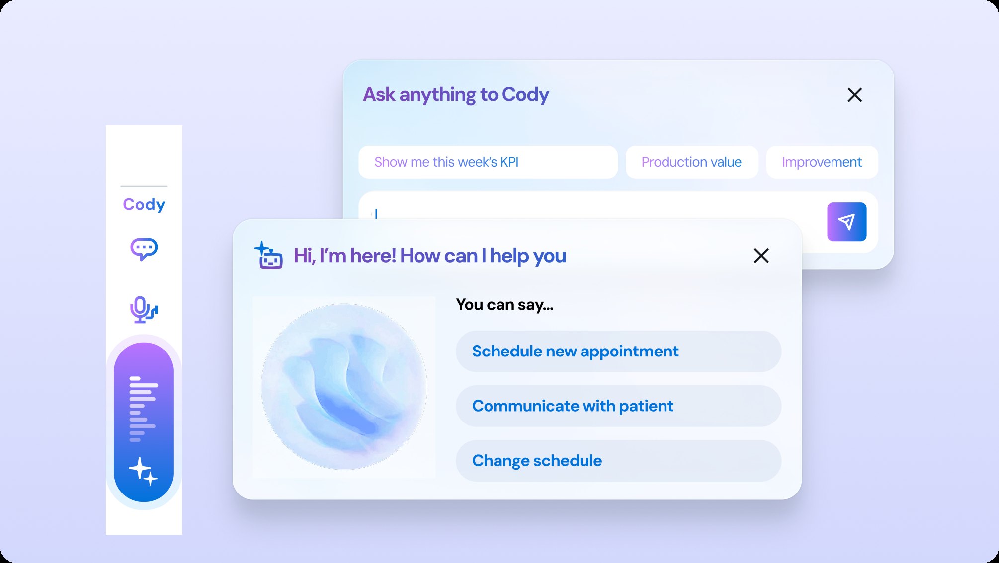
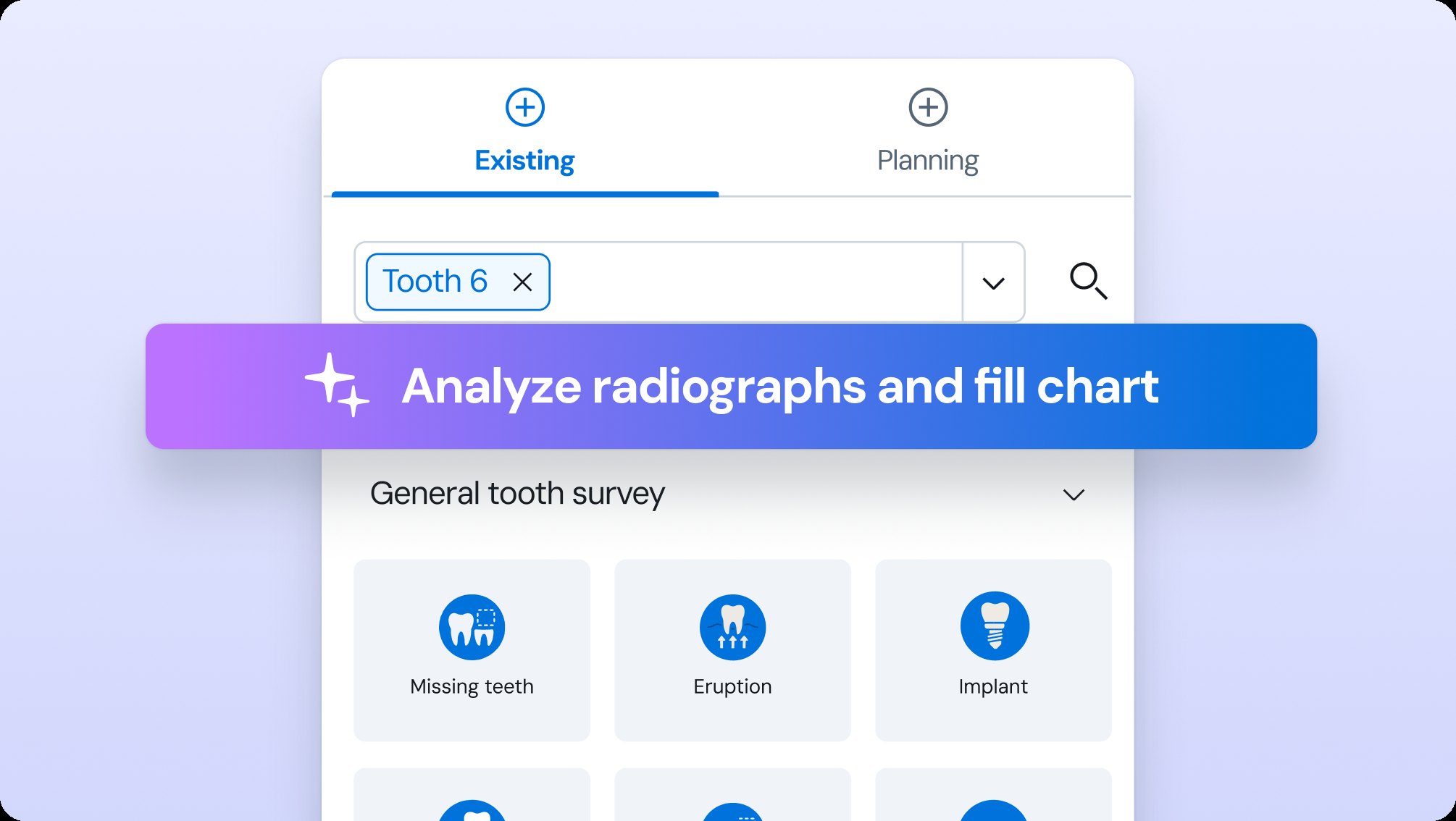
Speech recognition captures the dentist’s findings as they speak. A visible listening state makes the system’s activity clear, while manual input and confirmation let clinicians correct and complete the chart.

The design move

Put AI capture and manual correction in the same flow, so reviewing a finding feels like part of charting.

Goal−30% charting time per patient

How we iterated

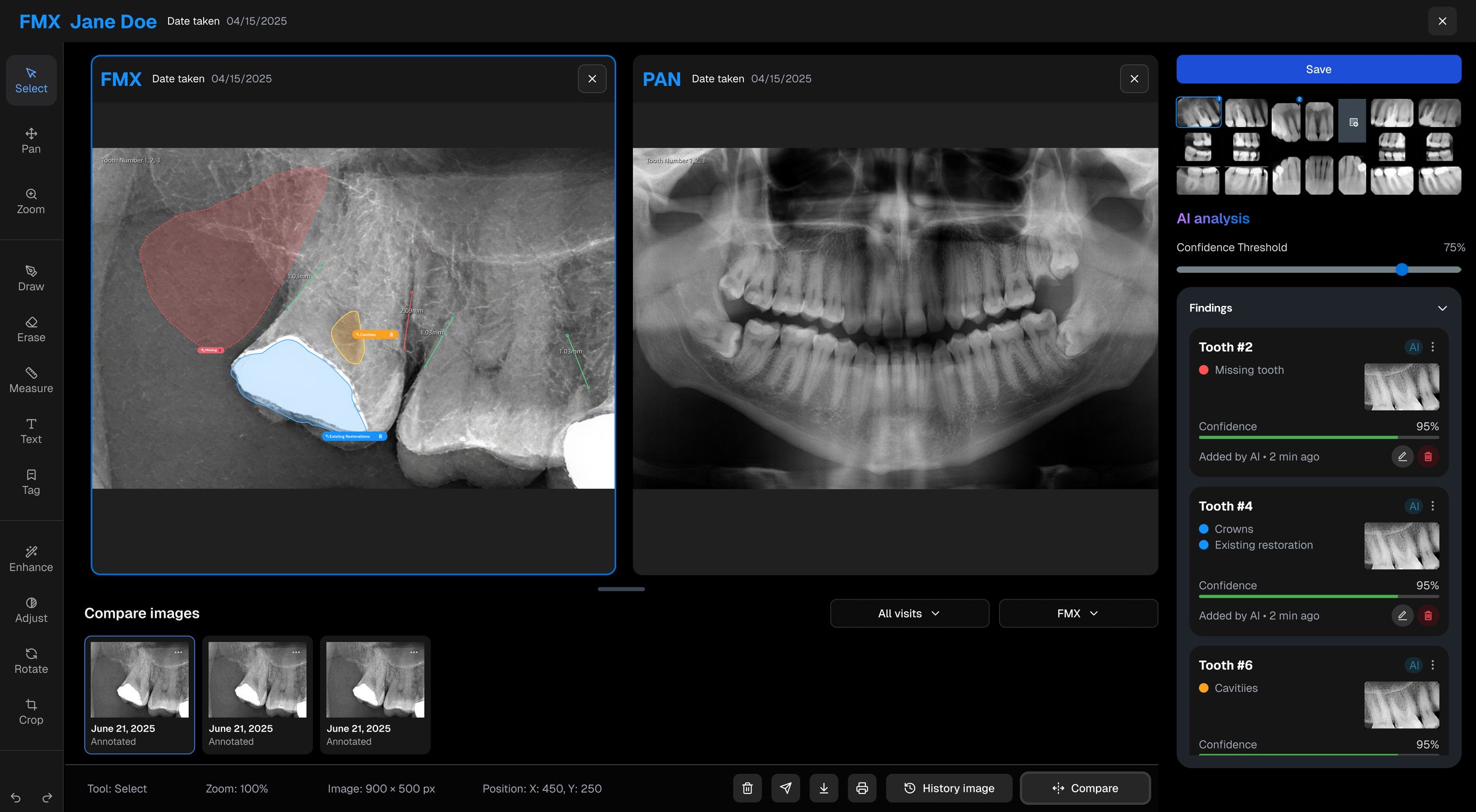
Radiograph analysis

Keep the evidence beside the finding.

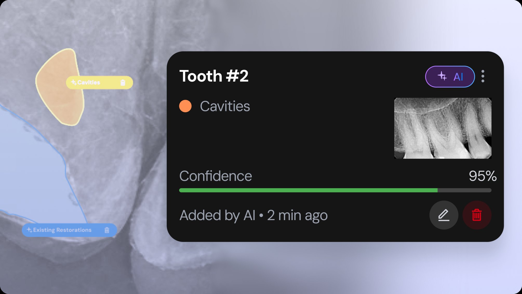
Color-coded overlays and confidence indicators help dentists inspect AI findings on the image. Reviewed annotations can be imported into the dental chart, reducing the need to enter the same observations again.

The design move

Connect image review to the next clinical action with an explicit “Save & Export to Dental Chart” control.

Goal−30% review time, accuracy kept

How we iterated

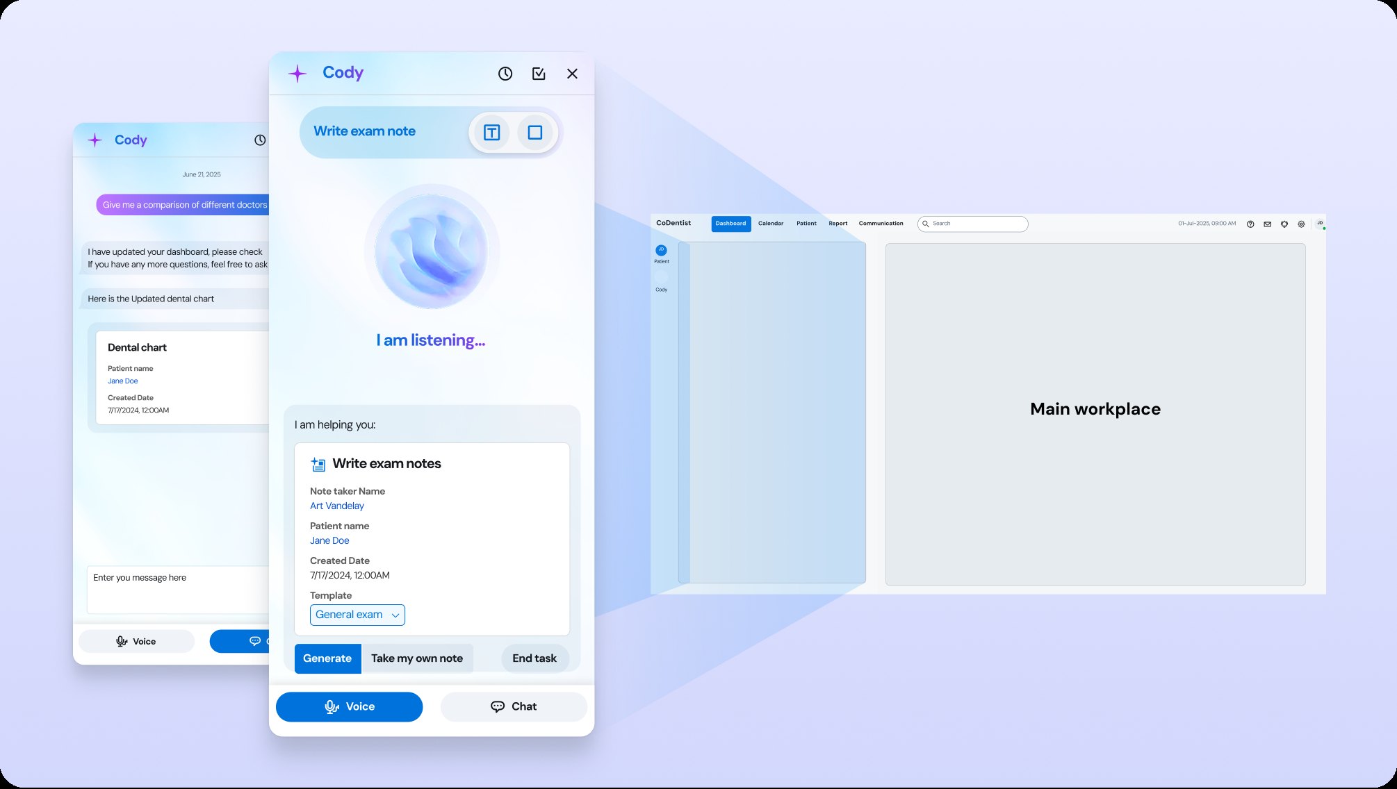
Contextual note-taking

Carry the visit into the documentation.

Notes combine conversation transcripts, recorded actions, and existing context in clinic-structured templates. Related images, procedures, and documents are linked through automatic tags.

The design move

Make note-taking available throughout the workflow, with the visit’s context close at hand.

Goal20–30 min saved per appointment

02

Turning clinical complexity into shared understanding.

How might one seamless communication flow serve the dentist’s clinical judgment and the patient’s understanding of his treatment at the same time?

Treatment-plan generation

Make the plan fit the person.

Patient history and financial preferences inform tiered treatment options. Clinical context, rationales, and clear pricing sit together so the dentist can review a plan and discuss it with the patient.

The design move

Bring diagnosis, imaging, patient background, and cost into the planning view to support a more informed conversation.

Goal+20% acceptance · 30–40% less communication time

How we iterated

Interactive 3D patient report

Let understanding travel home.

A 3D report visualizes findings, treatment, and progress over time. Embedded education gives patients a way to revisit the conversation and understand their care beyond the appointment.

The design move

Extend the clinical experience into a visual, patient-facing record, with care information attached to the findings.

GoalHigher revisit rates and retention

03

Connecting clinical work to practice operations.

How can we help practices move to the right next steps for each patient, while driving retention and sustainable practice growth?

Automatic scheduling

Turn the conversation into the right appointment, next steps included.

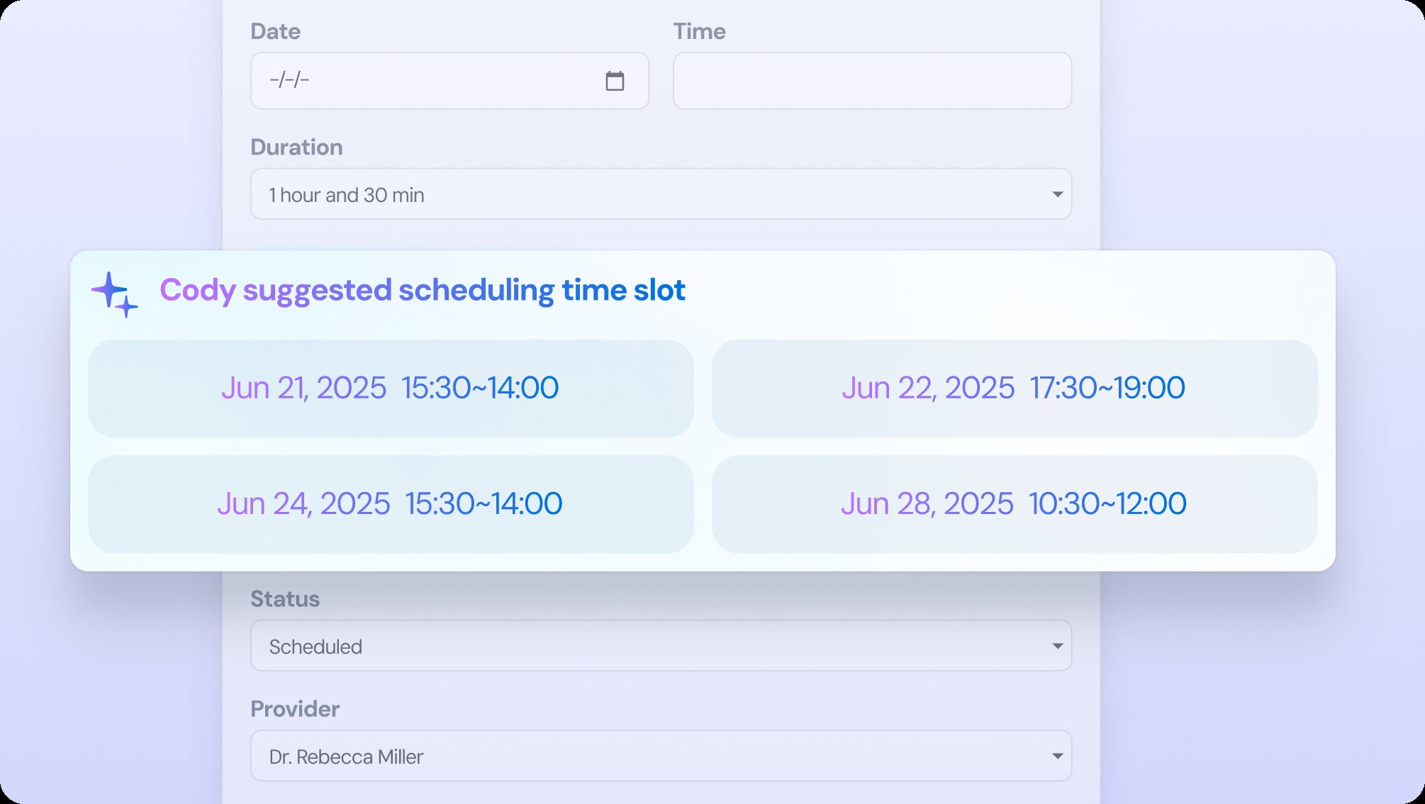
The copilot captures scheduling details from staff–patient conversations and helps add or adjust appointments as they are discussed. Next-step indicators make follow-up work more visible.

The design move

Place scheduling assistance in the conversation flow to reduce separate checks and manual updates.

GoalLess manual scheduling, better chair-time use

Claim generator

Gather the claim automatically and flag what’s missing.

Claim preparation brings required documents together and extracts structured information for validation. Citation markers show where values came from, making the assembled claim easier to inspect.

The design move

Make source information traceable at the point of review, where staff need to check details before submission.

GoalFewer rejections, faster cash flow

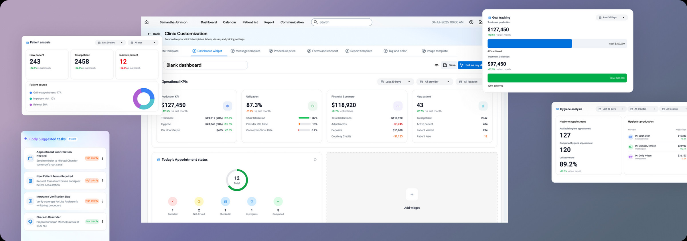
Role-based KPI dashboard

Start with what matters to your role.

Role-specific defaults surface relevant metrics first. Staff can rearrange widgets, ask questions about practice data, and explore suggested operational improvements.

The design move

Pair a useful starting view with customization, so the dashboard can match different responsibilities across the practice.

GoalLess time synthesizing reports

How we iterated
Design language

AI design principles

Across all patterns, AI is integrated into the workflow using a consistent visual language — unified colors, tags, and gradient highlights distinguish AI features from manual actions. This ensures AI feels seamlessly embedded in the experience, clearly visible yet non-intrusive, reinforcing trust while maintaining workflow continuity.

View cases
Copilot action

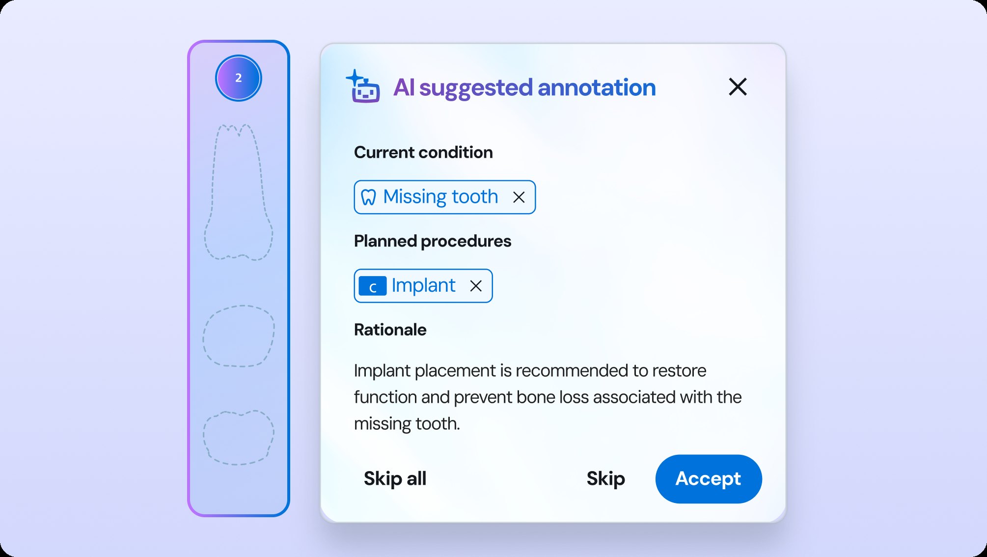
Clearly indicate user actions and AI actions, ensuring AI supports the workflow as a copilot without disrupting established human workflow.

View cases
Context-aware quick access

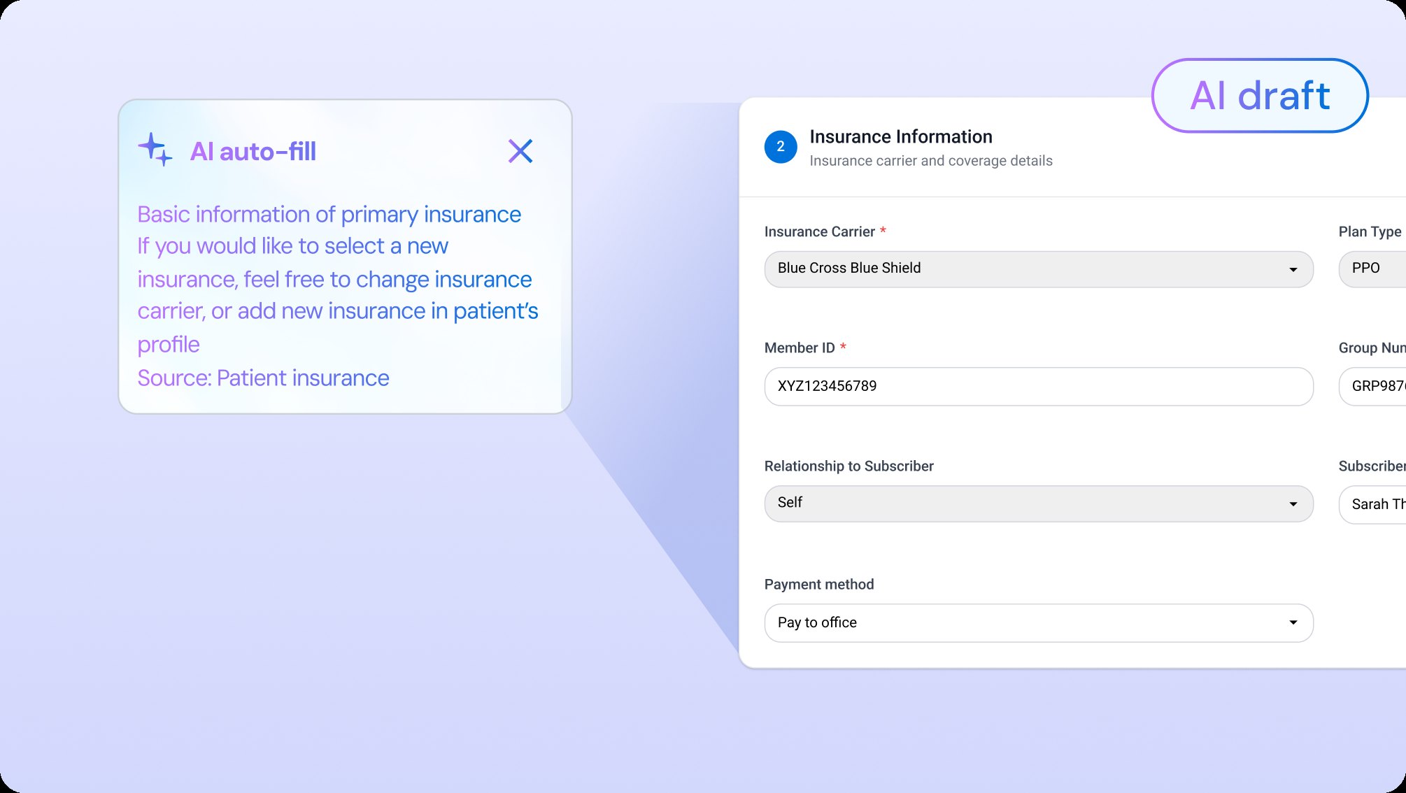
Quick access to AI that is aware of the user’s current context, offering smart shortcuts or recommendations directly within manual flows.

12
View cases
Transparency, human in the loop

Ensure AI results are traceable and editable, with confidence levels, citations, and tagging, always requiring human confirmation to build trust.

View cases
Proactive, predictive AI

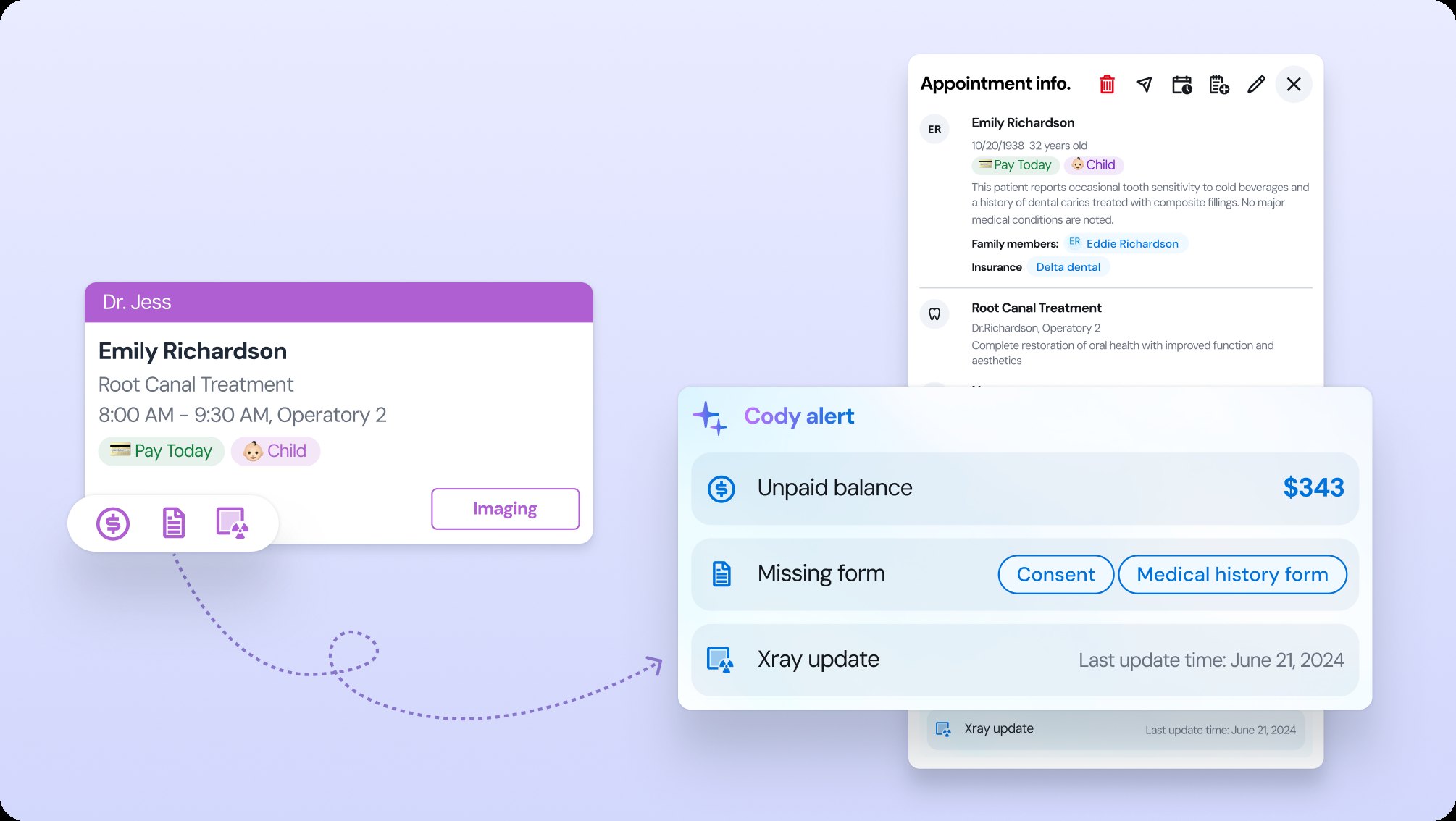
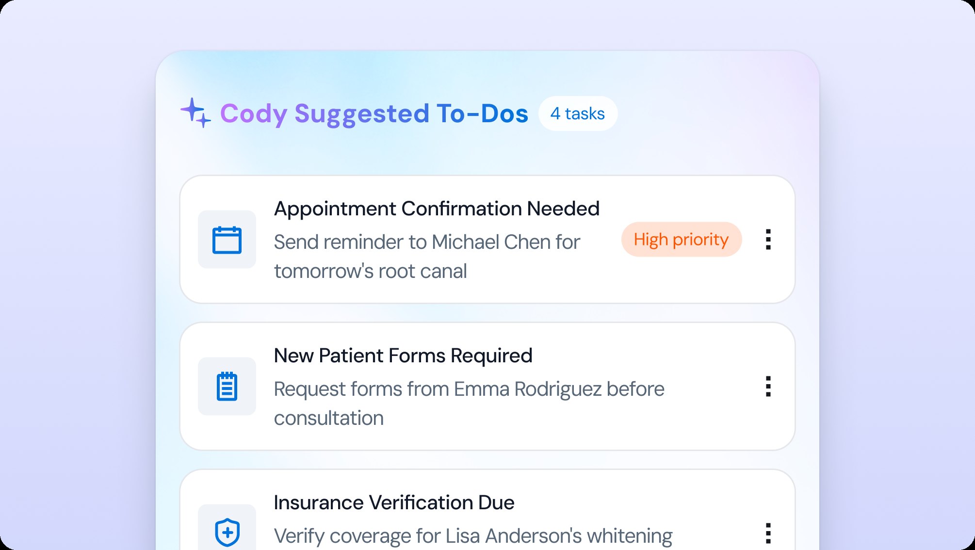
Beyond passive responses — AI works in the background to anticipate needs, push intelligent notifications, and suggest tasks.

Process

From insights to impact

A collaborative, AI-assisted process — from field observation to launch.

Understand
Design
Launch
Phase 1 · Step 1 of 4

Field observation

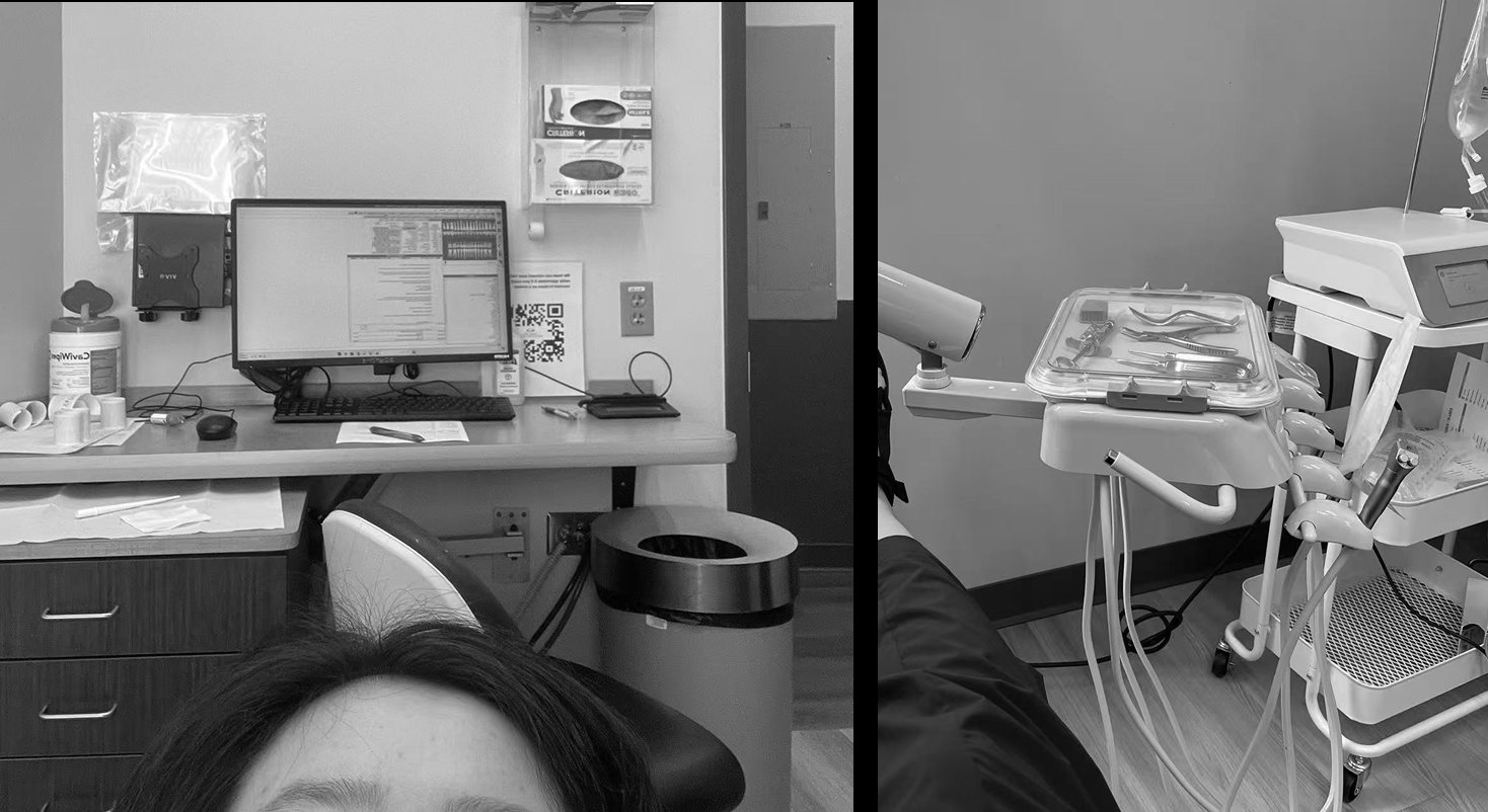
Visiting a dental office, I watched scheduling take multiple phone calls while the assistant recorded our conversation and re-entered it into the system — slow and distracting for everyone in the room.

1 / 12
Iteration

Iterating with users

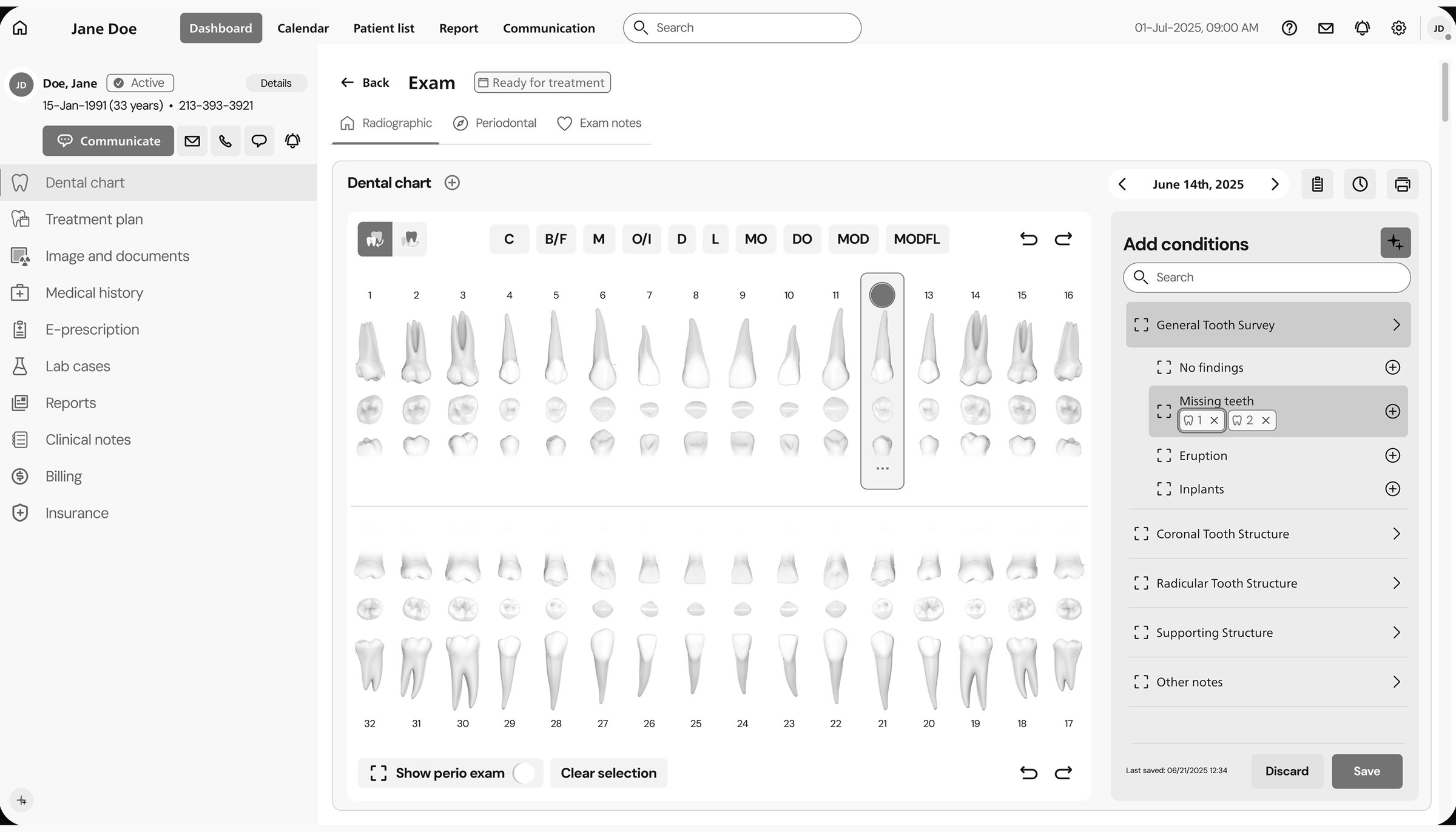
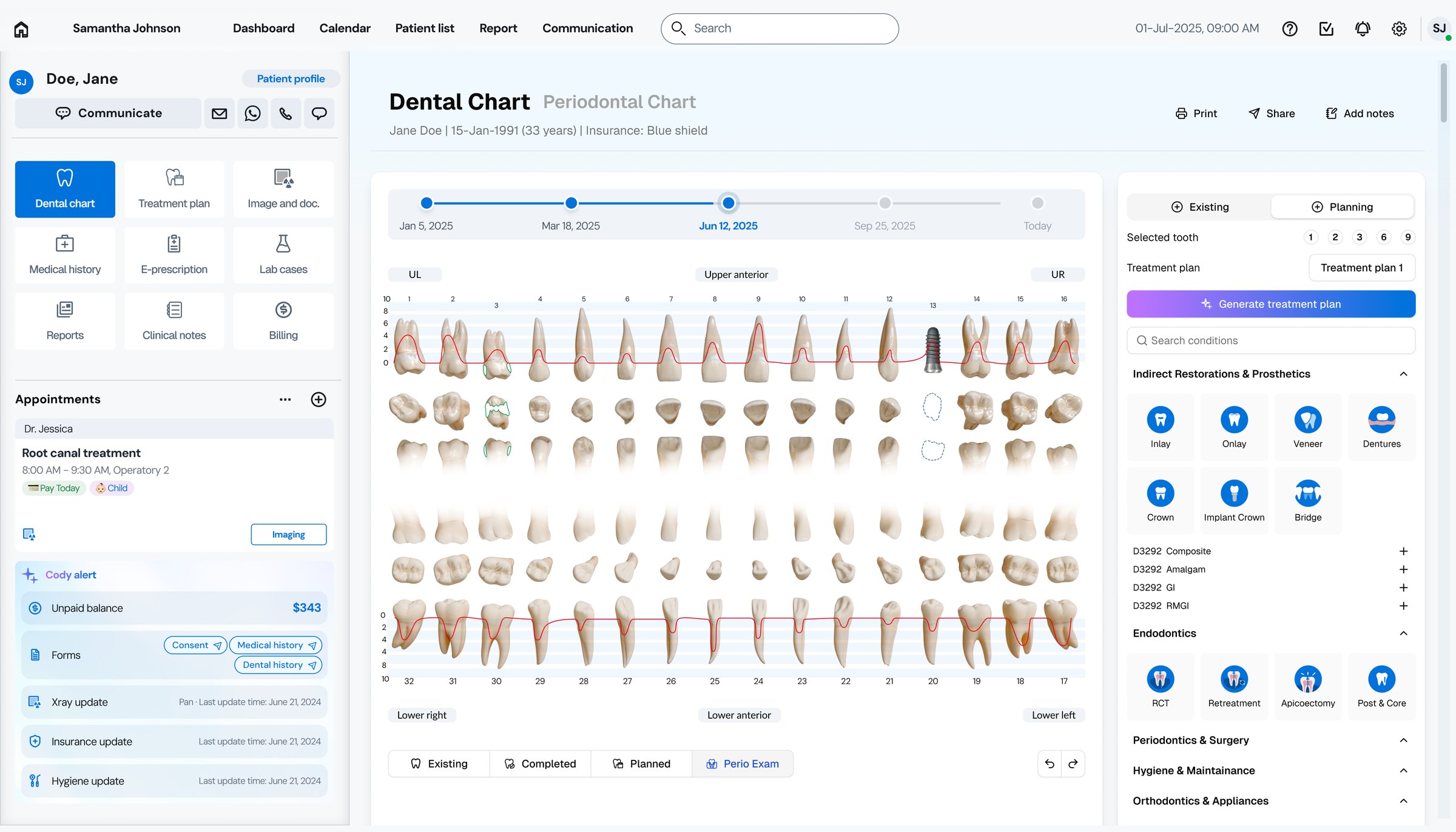
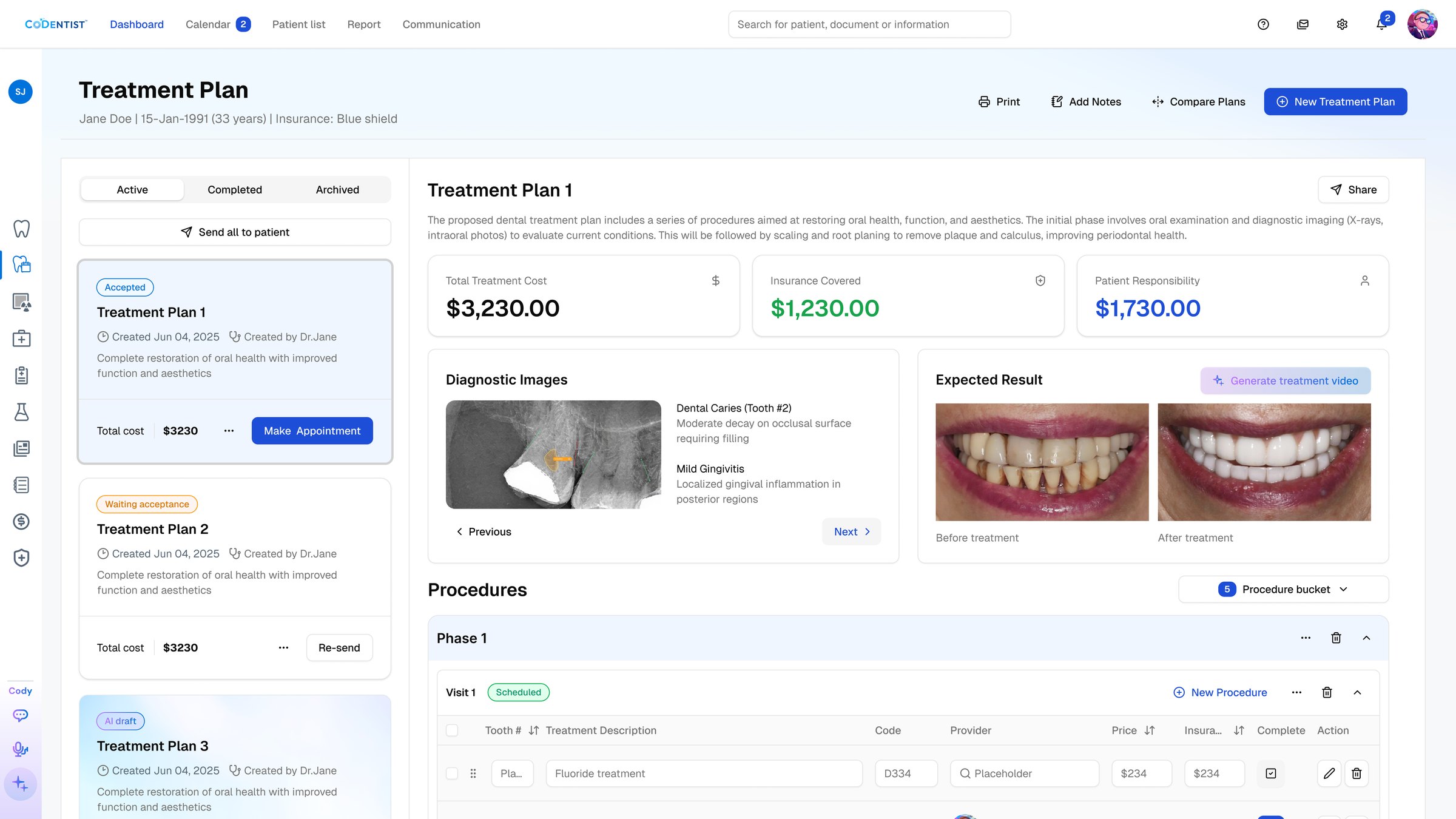
Dental chart — easier to record, easier to read

Before: the original exam screen — a grey, text-heavy dental chart with a separate conditions panel After: the redesigned dental chart — a visit timeline, realistic teeth, and AI shortcuts in one view
BeforeAfter
Drag to compare the original exam screen with the redesigned chart. Numbers on the redesign match the changes below.
What changed — and what we heard
1
Icons for readability and accessibility

To reduce reliance on dense text and codes, icons were introduced to make the chart more scannable — a direct boost to efficiency.

Heard in testing“The chart was too text-heavy, making it hard to quickly interpret.” — Dentist, user testing

2
Unified view for treatment plan and current condition

Previously, users had to switch pages to document treatment and conditions. The new flow combines both in one place, with AI shortcuts.

Heard in testing“Switching between pages to add conditions and plans breaks my flow.” — Dentist, user testing

3
Interactive timeline for past records

Date dropdowns were replaced with an interactive timeline, making historical data easier to navigate and condition changes over time visible to the doctor.

Heard in testing“To reduce reliance on dense text and codes, icons were introduced to make the chart more scannable.” — Dentist, user testing

4
More realistic 3D rendering of teeth

Enhanced visuals with realistic 3D-rendered teeth support clearer communication with patients and across the team.

Heard in testing“To reduce reliance on dense text and codes, icons were introduced to make the chart more scannable.” — Dentist, user testing

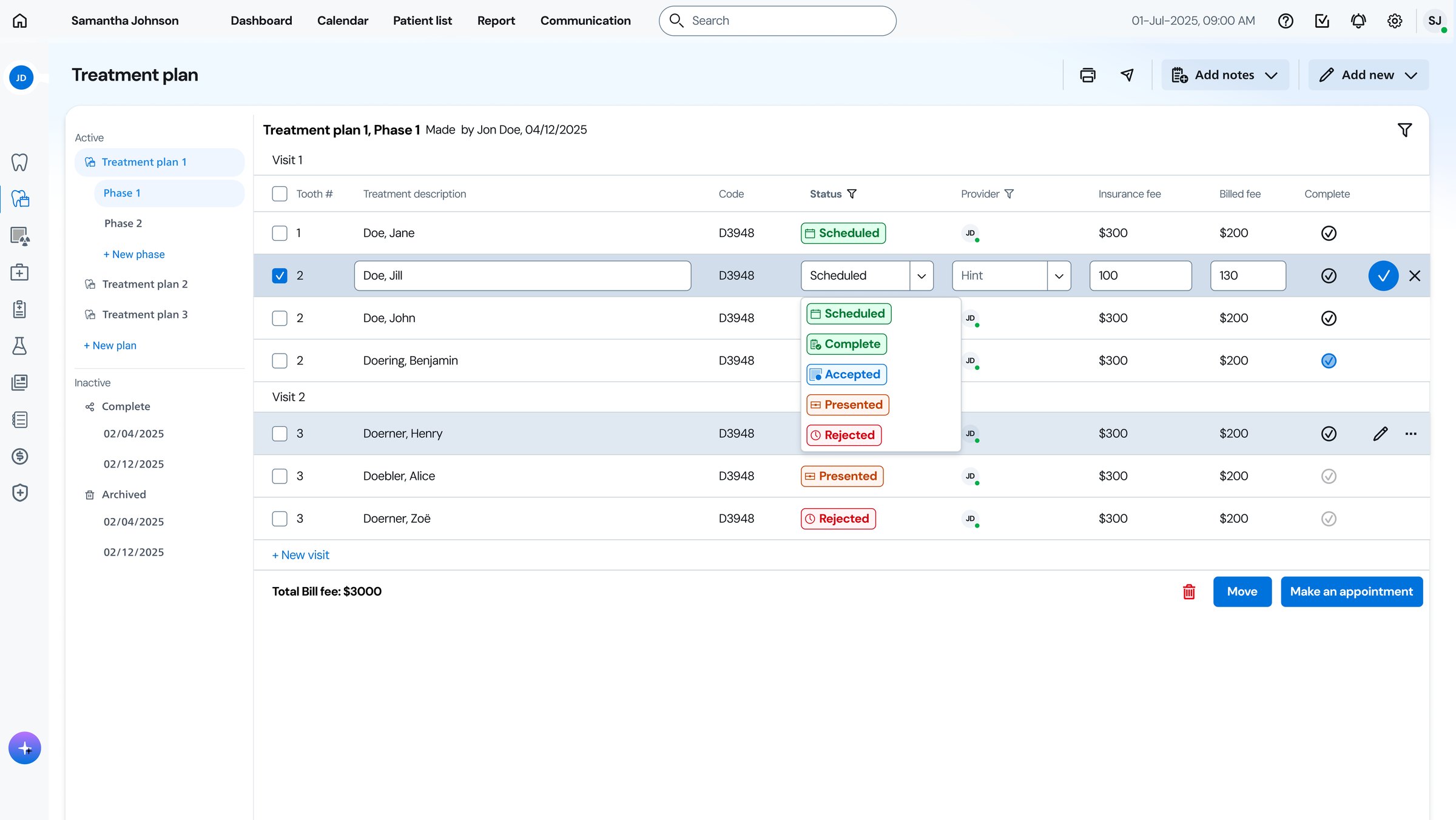
Treatment plans — designed to be accepted

Before: the original treatment plan — a dense procedure table After: the redesigned treatment plan — plan list, diagnosis with imaging, expected results and phased procedures
BeforeAfter
Drag to compare the original screen with the redesign. Numbers on the redesign match the changes below.
What changed — and what we heard
1
Patient information in the planning view

Patient details and customized tags sit inside the planning view, so plans fit the person, not just the procedure.

Heard in testing“When making a plan, I need to see the patient’s background — especially financial details.” — Dentist, user testing

2
Recent diagnosis and imaging in place

Recent results and imaging display inside the planning interface — no more page switching.

Heard in testing“It’s very frequent to click back to another page just to check the latest diagnosis or images.” — Dentist, user testing

3
Price as a first-class detail

Pricing is highlighted clearly, so patients and staff can review expected outcomes with full financial transparency.

Heard in testing“Cost is the main factor in whether a patient accepts a plan.” — Dentist, user testing

4
Visual preview of expected outcomes

A generated preview of the expected result makes plans easier for patients to understand — and accept.

Heard in testing“Patients often lack understanding of the treatment plan. Discussing it should be more engaging.” — Dentist, user testing

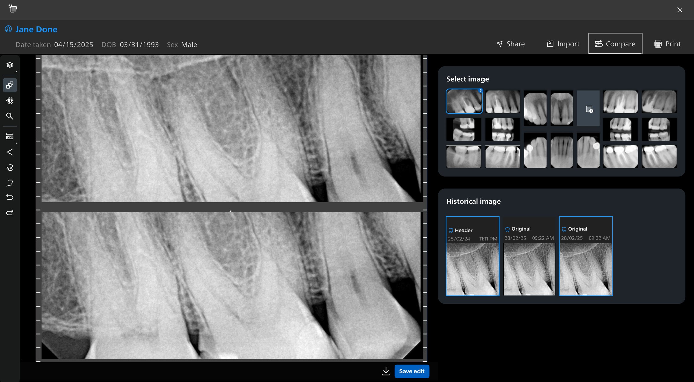
Image center — smarter viewing, richer insights

Before: the original image viewer — a single radiograph with a plain thumbnail grid and a short history strip After: the redesigned viewer — FMX and PAN side by side, AI findings in foldable cards, a history browser and labeled actions
BeforeAfter
Drag to compare the original screen with the redesign. Numbers on the redesign match the changes above.
What changed — and what we heard
1
Redesigned right-side panel with foldable cards

Multiple card widgets — AI toggle, AI findings, metadata, note-taking — offering richer detail and a more intuitive layout.

Heard in testing“The AI toggle feels too simplistic — I want to see details related to this image.” — Dentist, user testing

2
Optimized history image browser

History image switching became a folder-style browser with filters, so users can quickly switch images within the viewer instead of going back to the image center to select another one.

Heard in testing“Switching between past images is slow — I need a faster way to review history.” — Dentist, user testing

3
Improved image comparison

The comparison mode was optimized to allow cross-type image viewing with more screen space, supporting real diagnostic workflows.

Heard in testing“I often look at intraoral photos alongside FMX — comparing different images helps me make better decisions.” — Dentist, user testing

4
Accessible and emphasized buttons

Text was added to buttons for clarity, and the “Save & Export to Dental Chart” call to action was emphasized.

Heard in testing“I’m not always sure what some of these actions mean — the icons alone are confusing.” — Staff, user testing

Dashboards — tailored to every role

Dashboard iteration — clinic customization and role-based KPI widgets
What changed — and what we heard
1
Role-based defaults

Understanding each role’s workflow shaped defaults that surface the most relevant widgets first.

Heard in testing“I want to open the dashboard and instantly see what I need to do now.” — Office manager, user testing

2
Widget-based customization

Managers and staff arrange widgets to fit the data that matters to them, with a widget library that keeps growing.

Heard in testing“I’d like more widgets, and the freedom to choose what goes on my dashboard.” — Office manager, user testing

Reflection

Designing AI beyond the interface

Human workflow comes first

AI should never be added for its own sake. Understand the workflow, identify the pain points, then integrate AI where it brings value. We didn't reinvent clinical routines — we used AI to solve problems inside existing flows.

Know AI's capabilities

Voice recognition, computer vision, and reinforcement learning interacted across these workflows. Understanding how the systems operate and complement each other is what turns technical capability into a feasible feature.

Respect AI's limitations

Transparency and human autonomy are critical in healthcare, where AI must support — not replace — clinical judgment. Credibility has to stay visible: citation markers, confidence levels, and the ability to review, modify, and trace every result.

Use AI to accelerate the craft

Prototype in code, test with the team, refine with the design system, finalize in Figma for handoff through the MCP agent. This loop — quick prototyping, fast testing, iterative validation — proved vital in a startup environment.

How we iterated